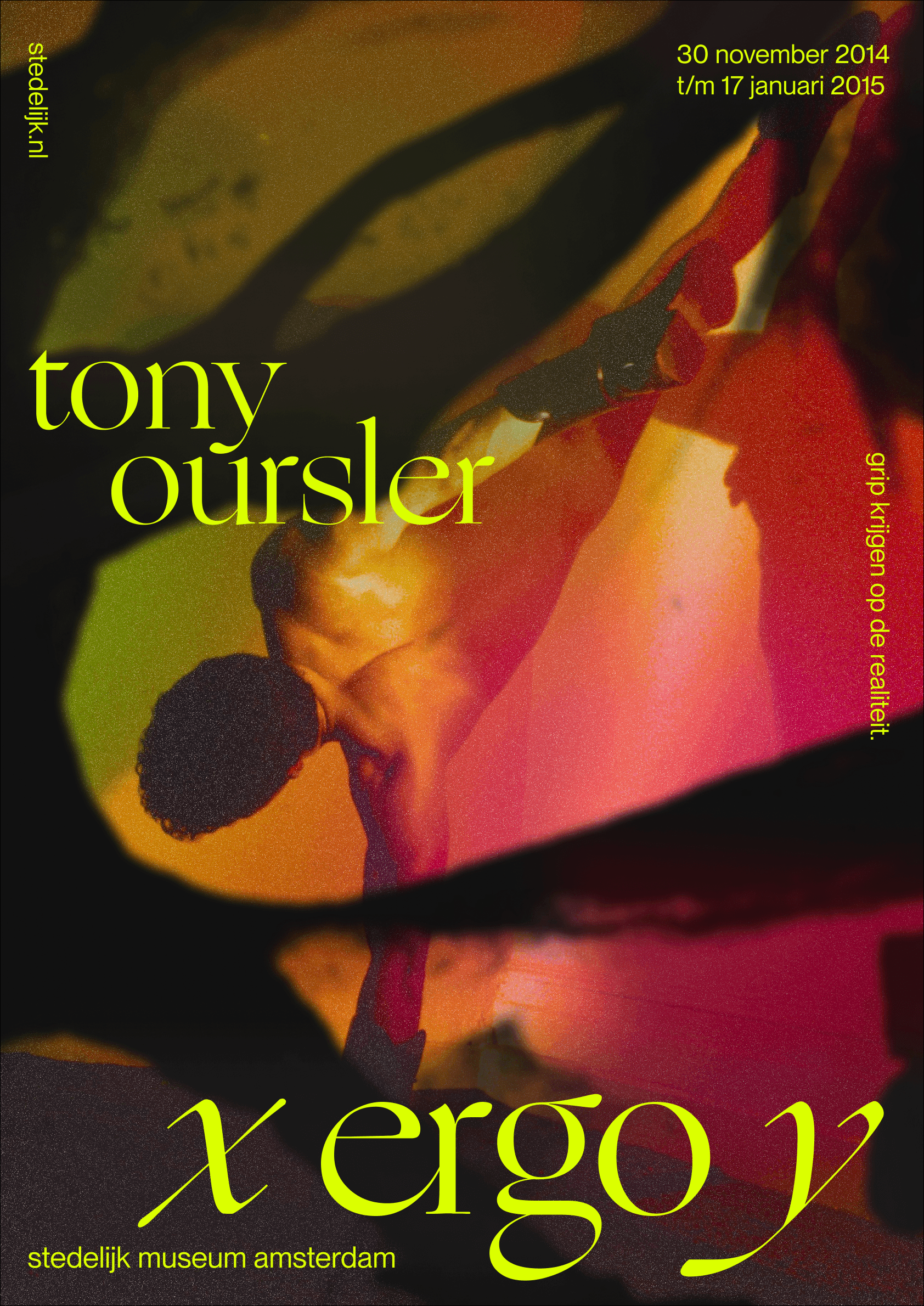
Hosted from late 2014 to early 2015, X Ergo Y was a projection installation in collaboration between American media artist, Tony Oursler and the Stedelijk Museum Amsterdam. Encompassing 5 weeks of visual experimentation, this project reimagined the exhibit's identity, investigating the artwork's themes of human philosophy and reasons for what we believe in.
Made by Nathan Lew, Francesca Reyes, Sahar Babaei and Elsa Sinuhaji


Building up a refined eye, early in 2022
This particular page covers the process of the first three of five weeks of an extensive UX project as part of an information design course at SFU. From March to April of 2022, I acted as the team lead directing the visual design and framed the problem space to efficiently and expansively build out our ideas.
Weeks covered
Graphic experiments based on precedent
Iteration from graphic qualities + principles
Refining identity from qualities + principles
Scaling digitally via microsite proposal
Finalized content, visual and interaction design
The first attempts
After looking at work from contemporary designers Irma Boom and Ellen Lupton, we had the most success after playing with the following techniques:
Revealing underlying content through organic shapes
Text as a framing device for composing space
Playing with contrasts in scale to set the tempo of reading
Using bleeds to expand the perceived space


Closer investigations continued into treating imagery with more organic curvature as a way to structure elements in a non-rigid manner—this time, testing new font pairings, noise and contrast in textures.


Direction 1—duality
Text as a framing device was kept as a principle but more focus was directed towards transparency and color work to lean closer into the techniques learned from Irma Boom. The varied opacities and overlapping images acted as a way to create new textural spaces with bleeding elements stitching objects together.
Combined with experiments in color, we attempted to see how the identity could be scaled in dark and light printed applications.


Direction 2—modular
Transparency, texture and new perspectives towards composing with organic shapes were considered by reconstructing imagery of hyphae, mycelium and fungi. By having this contrast of fluid imagery with a rigid grid, we explored a systematic approach to building out assets
To emphasize the structural qualities of this direction, we used GT Flexa Mono to shape orderly text clusters in each of the smaller compositional areas.


Direction 3—contrast
Going outside of conventionally geometric shapes to reveal content allowed us to lean into more skeletal structures to obscure experimental photography of the disfigured human form. With a sans-serif to serif pairing working in tandem with a complementary color palette, the use of organic shapes added a more eerily chaotic yet balanced quality to our work.


